Tuesday at Creightons - Dec 16

Hi, TACers!

Our sharing and discussion was fairly quick this time with just a few of us attending.


30 - Hard Edges
- Joanie started with her piece.  She didn’t enjoy this experiment and was stuck in it all being flat and hard. Her subject was looking out of her workroom window through the rain at the tree and houses across the street.  Because it was so grey she decided to use intense color-opera, yellow, blue and then outlined in pen.
- Carmel worked on an older rose  piece she had set aside.  It was big, bold and beautiful with rich pinks reds and purples.  She left white lines between her wet in wet shapes and there was intriguing detail in the stamens.  It was a bit Georgia O’Keefe-ish.
- Janie did koi and painted dry.  She managed to get very wet looking water with a dry brush and it sparkled with white paper showing through.
- Carol did two versions of a tangerine, one more toward botanical and one less so.  Shirley reminded us that mixing magenta and yellow can make a good orange.
- Marjorie did a second aerial view and combined it with the hard edges which she was much happier with.  She painted Thornton Beach, her favorite beach in San Francisco.  It was of the water, beach and trails in and around the dunes.  She used wax and frisket to preserve her whites.
- Shirley shared 3 pieces, two based on sand dollars and one with an ethereal figure with a red opera length glove.  Her first sand dollar was more somber in greyish hues and the second was hot and wild with oranges, reds and pinks.  She was more focused about where she wanted her hard and soft edges.  She also painted the first layer on a dark, rainy day with only window light and when she saw it the next morning it was so bright she decided to tone it down…but the colors were still pretty darn hot!

We WILL meet next week and the experiment is:
1 - Compose from the Top

Until then,
Joanie and Shirley

2015 Schedule for Friends in Art

This schedule is for the members of the Friends in Art group that meets at the Arboretum.

January 16*, 30
February 13, 27
March 13, 27
April 10, 24
May 8, 22
June 5, 19*
July 17, 31
August 14, 28
September 11, 25
October 9, 23
November 6, 20*
December 4, 18


* on these dates we will meet in the recreation room instead of the garden room.

It will also be posted on the "Schedules" page.
Thank you, Billy

How to Identify Artists by their Paintings

 Check out this link

 How to Identify Artists by their Paintings

Thank you, Carole


Flax Coupon


Have you all seen this?

Link to Flax Coupon

Thank you, Pam

Tuesday at Creightons - Dec 09

Hi, TCers,

As we were settling in Marjorie arrived and was “grousing”, which led to a discussion of the word. Interesting… (see end of post)

47 Paint from Aerial Perspective
There were some interesting perspectives this week!
- Pam used a photo she took this summer in the Sacramento Delta with rectangles and sinuous lines in greens, golds and browns. She was drawn to the patterns of the fields and river. She thinks she needs more darks.
- Mary is working on a full sheet and we saw the first layer. She is working from a photo of Sand Pond in the Sierra Buttes. She is finding that working from the top and side at the same time ischallenging. She had some beautiful color combinations. She is working very realistically and at the same time the piece looks very abstract.
- Carole didn’t bring a piece but she was busy “absorbing” and being decorative!
- Shirley decided to just have fun and painted the starship Enterprise hovering over the earth, which she composed on the computer.
- Joanie did a cup of coffee, big and cropped. Her bubbles looked pretty real.
- Janie did a charming and cheerful map of her neighborhood.
- Carmel’s was an intensely colored everglades in greens, blues and purple with a pop of rust-yummy!
- Marjorie wasn’t very happy with hers (remember the grousing?) She wanted to see what would happen if she used two yellows-lemon yellow and naples yellow-and said it was Toxic Waste in the Arctic. We agreed with her title but disagreed with her that it wasn’t okay. It was actually very interesting.

Jeanette popped in near the end and shared her Design Class work, mostly in black and white. Some really interesting work.

We had talked about maybe having a show at Creighton’s but they can’t move the artwork that is already there so it is a “No Go”.

Next week: 30 - Use Mostly Hard-Edged Shapes - pgs 89 + 91

Holiday Schedule: We will meet next Tuesday, the 16th. We will decide on the 16th if we will meet on the 23rd.
See you Tuesday! 
Joanie and Shirley

grouse (v.) “complain,” 1885 (implied in grouser), British Army slang, of uncertain origin but perhaps from Norman French dialectal groucer, from Old French groucier “to murmur, grumble,” of imitative origin (compare Greek gru “a grunt,” gruzein “to grumble”). Related: Groused; grousing. As a noun from 1918, from the verb.(Online Etymology Dictionary)

Tuesday at Creightons - Dec 02

Hi, TACers,

Quick update for Nov 25 and Dec 02 gatherings…


Nov 25
21, Grey Fields with Bright Accents and #59, Use Just One Brush.
- Avelina used a 1 inch flat to create a garden and did a piece to add to her memories of her grandmother.
- Heather did a still life with greys and yellows and appreciated Kay’s color charts.  She was playing with combinations and became reacquainted with her #30 round.
- Janie did leaves and used a “mother puddle” to create her greys.  She included wax, a spray water bottle and Kleenex, all to good effect.  With her one brush she did golden trees.
- Shirley did a sheet full of shapes with one brush and lots of neutrals and she discovered that she loves “on the way to grey”.
- Peg painted statuary in a garden in fall with greys and yellow.  Her one brush was a seated figure with yellows and russets.
- Carmel did her grey and one brush in one piece with trees and she had a bit more to do.
- Joanie did shadows across her paper and an abstract and did both with one brush.
- Mary finger painted with her 3 year old granddaughter.  They used only 4 colors and she enjoyed what happened with the limited palette, not to mention the fun! Hope she brings them next time.
- Marjorie used a #20 brush to paint birches, completed her staining and layering and another piece in her fortune cookie series.
- Shirley shared her sand dollar that she is doing for her CCSF class.  It had layers of paint, embossing and the lovely silk and steel thread that Carmel gave her.  Should be an A!!!

If you have any materials that you and/or friends wish to sell or give away you can put a notice on the blog.

Shirley has a friend that is making watercolor paper.  He is working of the formula and more information will follow.  It is also a possible field trip in the future.

Dec 02
 12 Choose a Single Value
- Sue brought the new Turner book, “Turner By The Sea” by Christine Riding and Richard Johns instead of a piece.  There was lots in the book that fit the experiment.
- Marjorie brought her “Expressionism” book.  She also brought 2 pieces, one light and one dark.  Both used similar colors but with dramatically different values.   She learned a lot!
- Janie did a skyline twice, one in light values and one in medium values and she also learned a lot.
- Shirley did a field of plant-ish things in dark values.  She used her favorite gold colored pencil to good effect.
- Avelina’s ice cream vendor and cart was a riot of color in medium values.
- Peg didn’t enjoy this one much and felt her piece was unsatisfactory but she did learn that she will pay more attention to value.

There was discussion of how value effects the viewer and it can be a useful, subliminal tool.  Also, it may be effected by what colors are next to each other.

Tip:  To help with areas where you will have edges of paint overlapping you can use a clear colored pencil to save the edge.  They are a little waxy and create a little dam.
Two movies recommended… Twenty Feet from Stardom and The Sapphires.
We will be meeting through the holidays.

Next week is #47 Paint from Aerial Perspective.

Celebrate the Rain!!!
Joanie and Shirley

The Academy Library


Thank you Pam and Diane and my loyal photographers.

Kay Russell, Small Works Exhibit


Tuesdays At Creightons - Nov 11

Hi, TACers, (Tuesdays At Creightoners)
We were a big group of ten today and took most of the chairs!  We were also noisier and chattier.

Shirley asked our hostess if there was anything we could do for them and, as usual she said “no” but Shirley pressed on and asked if positive Yelp reviews would be okay and this was greeted with a much more positive response. So, please, take the time to give a positive review, although you might want to also say that Tuesday mornings seem a bit busier than other days. :o))

On to # 53, Elusive Planes.  Many of us found this project difficult although we did a pretty good job of it. Our enthusiastic Marjorie loved it!
- Avelina did “Elusive Trains” in gentle colors with spots of brights. She also did “The Elusive Crosswalk” with her familiar version of people in a similar color palette. Both had a sense of movement. She also did a sweet portrait of a young girl in graphite with a very colorful background and this made her much happier.
- Janie did a fall tree that was more elusive that she thought. We saw cactus and cliffs as well!
- Pam shared a small watercolor sketch from a walk in West Marin where a path disappeared into trees with lovely light.
- Shirley was exploring Kandinsky and tried denser and denser spatter. She worked from the bottom up and added one of her favorites, splatter, and some ink.
- Sue did a quiet piece with Viridian Green and Chinese White with plastic wrap. She used saran wrap and the result made us think of ocean, waves, glaciers……
- Marjorie was gone for three weeks so she was playing “catch up” and managed to marry a couple of the experiments quite successfully. First was a blue and green with frisket and candlewax, then she went bigger with reds and purples which was a response to a fortune cookie fortune (I will continue to take chances and be glad I did), and finally a greenish, blueish, goldish piece with more wax and frisket that took us to mystery places. One of the pieces had a place where the water and paint puddled thickly and it was a bit shiny when it dried and we thought that could be useful.  They all had a lot of energy, just like Marjorie.
- Carmel also enjoyed this project and liked that the planes lend themselves well to geometric designs. She incorporated alcohol, salt and tea and it made her paper stink but the color moved back and forth and no one has to smell the paper anyway.
- Joanie did a moon picture of a moonrise she and Shirley saw last week but she wasn’t thrilled with it.  Then she did another of the bay with that pinky/mauvy look the atmosphere gets around here sometimes and she felt that was more successful.

There will be NO MEETING AT CREIGHTON’S NEXT WEEK!!!!  We will be going to the Academy of Sciences on a Field Trip arranged by Pam. The trip is full and those who registered will be getting an email from her with details.

Our next meeting at Creighton’s will be on November 25 and we pulled two experiments:  #21-Grey Fields with Bright Accents and
#59-Use Just One Brush
If you are feeling clever you could combine the two!

Have a great two weeks!

Joanie and Shirley

Cafe Seventy8 Reception

We had a great time at Cafe Seventy8. Artists enjoyed the friendly atmosphere of the cafe, along with their friends, partners, spouses and other family members. Wine and coffee was imbibed, art was appreciated and it was good to see everyone celebrating their love of this medium. The pieces worked together to make a cohesive show and were just lovely, well executed and hung to show off their best qualities.


The show will be at the cafe until Saturday, November 29.
Cafe Seventy8, 28 29th Street, San Francisco

Tuesday at Creightons - Nov 04

Hi Folks, this is not Joanie. She had to strip her dog.

Before I get to the usual news, I want to encourage all you painters out there to meet with us whenever you can. The group is populated by smart, talented, enthusiastic, supportive and fun people. We all benefit from this time spent together.

#15: Express a Mood
- I tried painting while listening to a Maria Muldaur CD. I thoroughly enjoy painting to music and often use it to set a mood, especially if I am working on something that will take some time. It sets a tone that I can match for the duration of the piece.
- Peg brought in painting of a specific model that inspires some of her best nudes. Hot, sweaty and strong!
- Marjorie wanted sparkle and to keep her whites no matter what, so used a combination of candle wax, frisket and salt. Her abstract was active and had a sense of depth within the colors. She was able to reconstitute her old frisket with water with no problems.
- Avelina celebrated her joy over the Gigantes winning with a painting of figures either dancing in the streets or engaging in an orgy, depending on how you held the paper. She followed up with another painting of a lady in the hills, either reclining peacefully or recovering from a hangover. Avelina is sometimes a wild woman.
- Carmel produced a lovely landscape, subtle and tranquil (not lonely) with a yellow sky.

Misc.
Carole was working on the exercise from the week before. She did create mud and there was a lot of discussion of how not to do that:
.Use paints with the least amount of pigments in the ingredients. For more information about pigment numbers, go to Pigments through the Ages
.Even in wet-on-wet, you can isolate the mixes to stay mostly with two colors. It's that third color that is the killer.
.Try the Cyan/Magenta/Yellow color wheel, instead of the Red/Blue/Yellow wheel.

Sue brought an abstract leaf/arrowhead/boat image that needed a background. She is thinking about stamping patterns or deep washes with a white outline around the edge of the form. She also showed some plein air landscapes in her carry-about book.

The Watercolor Artist Magazine for Dec 2014 has an article on using your blues that Avelina highly recommends. Here is a link to their website:Watercolor Artist December 2014 Issue

For those interested in Zentangle (the patterning/doodling we talked about) here is one of thousands of sites: Zentangle

 Next exercise: #43 - Create Elusive Planes - pgs 116 + 118
Cheers, Shirley

The Bernalwood Blog

We are immortalized:
Click on this link to read about our meetings at the Bernal Heights Public Library and our upcoming show at Cafe Seventy8:
Bernal Watercolor Geeks Unite!

Tuesday at Creightons - Oct 28

Hi, Creightoners!
Shirley and I have just returned from FLAX after our gathering with some really cool syringe and tip sets that we found there and as soon as I finish this I am going to squirt paint all over, all afternoon!
Our meeting was quick today.  There were seven of us and only five of us had work.  The experiment was #10-Use only wet washes.
Janie, who we hadn’t seen in awhile, shared her Moroccan blue boat that she had painted as a gift for a friend.  It as lovely, and what a great gift!!  She also shared a scene from Bruges, Belgium and we were captured by her trees which she did with sponging with a sea sponge.  She had one of unfinished trees that was promising.
Pam had two pieces.  One was a sunset in her little sketchbook.  Soft and dreamy.  The other was of pampas grass and she really captured the sense of wind blowing the grass.  She was challenged by working fast and enjoyed it.  She pulled out a surprise “wet on wet” beautiful silk scarf she made!
Carmel did a scene of forest and lake in blues, greens and purples and there was one little spot where she used a bit of color from her palette that was a lovely soft neutral.  This brought up a quick discussion of those little spots, puddles, colors on our palettes.  They are often a combination of the colors we are using for a painting and therefore make the perfect neutral/shadow colors.  Between us we called it “palette mud”, “mother puddle”, or even the dirty water as “mother water”.
Shirley didn’t bring a piece because it is in process…a 3D version of a Muni bus.  We get to see it next week!
Peg worked very wet and “drew” with water.  A forest scene with the path of a dragonfly in the air.  She used Winsor Blue, green shade for sky which she thinks is the perfect sky color for a clear day.  She was reminded in the process to BE PATIENT!  She also reflected on the example piece and how it was carefully developed and not too rushed.
Joanie did a big persimmon with the fruits that Carmel brought last week and she “made up” the #2415 experiment with Agrostemma seed pods in purples with a yellow-green background and washing off color with her water bottle and made a big mess all over her painting table.
Pam went to the Legion of Honor to see the Houghton Hall exhibit and thought it was worthwhile.  There were 3 portraits by John Singer Sargent, plus landscapes and charcoal sketches.  There was art in many forms there and if you go on Saturday or Sunday and are there at 4 pm you can listen to a free pipe organ concert.
The field trip to the Academy of Sciences is scheduled for Tuesday, November, 18 from 10-12.  More information elsewhere in the blog.
There is also an exhibit of botanicals at the Arboretum Library.
Next experiment is # 15-Express a mood.
Until next week,
Joanie

Academy of Sciences Field trip

field trip -


We have set up a visit to the California Academy of Sciences Library for Tuesday, Nov 18, from 10 am to noon.
 
The Librarian there is also an artist and has been researching the collection for things to show us. If you have any illustrators or authors you like and want to see if their work is in the Academy collection, you can send the info to me or go on the Academy website and check the library catalog at http://calacademy.worldcat.org. 
These requests will need to get to me in advance so we have time to research and pull the books. 

Also, we will get to see one of the few Audubon elephant folios. It is open to one page only (as it takes four people to turn a page), but it is still unique. On display in the reading room is a predecessor to Audubon. One can easily see how the style changed over time to what we know as Audubon's compositional format.

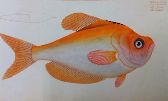
After our time upstairs in the library, those who are interested can accompany me to the Museum floor to see if the original watercolor illustrations from the 1905 Galapagos Expedition. These works by Toshio Asaedo’s, are of fish discovered on the 1905 scientific research trip long before color photography was invented.

Possible add-on to the excursion: the Library at the Strybing Arboretum currently has on view original botanical art from Mary Harden’s advanced and/or Master students. It is just around the corner and free to visit. The exhibit will be up until the end of November. 

There is room for a maximum of 18 guests to the Library. I will need a list of names prior to our visit and each guest will need to show picture ID upon entry, so please let me know if you are interested in attending. 

If you would like to attend, please contact me at: emrldhills@aol.com
See you there, Pam

Tuesday at Creightons - Oct 21

Hi, Tuesdays at Creightoners,
It was a small group to begin with today.

- Carmel brought her beautiful book of Gary Bukovnik floral watercolors and several of us drooled over it. Thanks for sharing, Carmel.

Just a few of us did the assignment this week.
- Carmel did a landscape of flowers that layered back with beautiful purples, pinks and a pale aqua, all quite abstract.
- Shirley kind of did a double duty thing by using her time at the Painting Experience and created a big swirl of intense colors, mostly pinks, purples and blues, (did you and Carmel confer????)  There was a burst of rays in the same colors behind the swirl.  Apparently you shouldn’t remove paint from a piece at the Painting Experience as part of the process but Shirley admitted using her sleeve to secretly remove some paint!  She was using tempera, which is also a water based medium.  She will do almost anything to create her vision!
- Carole D. is home from Italy where she had a wonderful time.  She did a landscape with lots of greens.  She wanted advice about the front area, which was a bit dense, and got lots of good ideas.
- Peg came a little later and brought a figure in which she lifted with a paper towel and decided she liked the pattern that the towel accidently left on the paper.  She also did a study in blues where she scrunched a dried hydrangea she was going to toss onto a wet blue wash, let it dry and then enhanced the result to good effect.  She learned more about staining colors in the process. She shared some of her work from her Morris Graves retreat.  She played with mixed media and realized that she likes paper as much as she likes painting.  One of her pieces had some lacy rice paper included.
- Pam talked about a painting she had done of a horsetail that she didn’t have with her. She layered a staining yellow and green apatite genuine from Daniel Smith.  It was framed at home and was a bit large to bring. She had a little piece of a woman on a lake in Zambia and wanted ideas on how to handle a bright red shirt on the woman.  Again, many good ideas.
- Joanie was preparing for her mid-term critique and over did it so she didn’t bring a piece for the experiment but asked advice in making her feather painting look soft and fluffy.  As always, her tablemates offered lots of good ideas!
- Carmel brought a big bag of persimmons and several of us took some home with the intention of painting them.  Thanks!
- Jeanette popped in to say hi near the end.
- There was a discussion of color related to transparents, sediments and stains.  Here is Joanie’s list found in old notes which is mostly from Kay Russell.  It is for reference and just a start.  Do your own experimenting.  Every list is a little different and many paints fit between categories.  You can also go online to product websites for information or check the Wilcox color book although it isn’t totally up to date.
- TRANSPARENTS:  Aureolin, Lemon Yellow, Rose Dore, Rose Madder Genuine, Cobalt Blue, Viridian, Burnt Sienna and Van Dyke Brown
- SEDIMENTS:  Any hue of Cadmium Yellow, Naples Yellow, Cadmium Orange, Buff Titanium, Yellow Ocher, and hue of Cadmium Red, Indian Red, Venetian Red, Potters Pink, Cerulean Blue, Ultramarine Blue, Manganese Blue, Terre Vert, Raw Umber, Burnt Umber, Raw Sienna, Sepia, Payne’s Grey, Ivory Black, Daniel Smith ‘Lunar’ colors, Daniel Smith Primatek/Genuine colors, Daniel Smith Iridescents and Pearlescents
- STAINS:  Alizarin Crimson (All Alizarins), Scarlet Lake (all Lakes) Winsor Red, Opera, Rose Tyrien,  Permanent Rose (all Permanents), New Gamboge, Thalo/Winsor Blue, Thalo/Winsor Green, Antwerp Blue, Sap Green, Hooker’s Green, Dioxazine Purple, All Quinacradones.
Hope this helps….

Next week’s experiment: #10 Use only Wet Washes.

Until next Tuesday, Joanie

Gary Bukovnik at Thomas Reynolds Gallery

exhibit -

Not Just a Rose
Watercolors by Gary Bukovnik

October 18 - November 22, 2014
Opening Reception: Saturday, October 18, from 5 to 7 pm


Link to more information: http://www.thomasreynolds.com/gb_b.html

Cafe Seventy8 Show

Watercolor Community of San Francisco invites you to our 4th Annual Group Show

Carmel Adams | Gail Block | Juliet Digiovanni | Jane Dubuque | Shirley Edwards

Joanie Helgeson | Jo Hunter | Avelina Leanos | Peg Robinson | Jesse Schlenker
Heather Solway | John Webster | Laurie Wigham


Reception:  Friday, November 07,  5 - 7 pm
                    Cafe Seventy8, 28 29th Street, San Francisco
   
Show available: Sunday, November 02 through Saturday, November 29

Contact: 415-205-7015 / zygote1955@yahoo.com

A Bit of Art History - Fauvism


Fauvism  (Les Fauves – The Wild Beasts)
Paris  1905-1907


The term "Wild Beasts" was coined after an art critic viewed an exhibit at the Paris Salon d’Automne in 1905 of the works of  Matisse, Vlaminck, Derain, Maguin, Marquet and Puy.   They all studied at the Ecole des Beaux-Arts in 1895 under Moreau.  As a teacher Moreau believed that all students of painting had a duty to discover their own artistic personality rather than to follow blindly rules and precepts laid down by tradition.  In 1906 these artist were joined by Le Havre, Friesz, Dufy and Braque.

By the end of 1906 the novelty and excitement of Fauvism was over and many Fauvists moved on to explore other styles. It was apparent that Fauvism was not a school of painting (as Cubism was to be), but a restless search for style.  It was more a spurt of energy than in the steady rhythm of sustained progress.  Because it did not present a program or enforce any rules, the Fauve movement seemed minor next to Cubism, which took over the avant-garde limelight as early as 1908.

This may help to explain it’s brief life:
Fauvism owed a considerable debt to Monet, whose non-naturalist color schemes had caused such a scandal in the mid 1870’s.  From dot’s to bold colored strokes, with simple compositions.  Fauve paintings were fashionable and desirable works on the market during the Fauvism period.  It would be safe to say that the Fauves’ heyday began in 1905 and remained on the public radar for two more years. 

Matisse’s passionate conviction that new art could and should find a public singled him out as the driving force and leader of Fauvism.  By 1908 the name Fauve was starting to be used as a label synonymous with “avant-garde”.  Broadly speaking, Fauvism followed where Matisse and Derain led.   Matisse was the leading Fauve because he was the most celebrated painter, therefore making him the most sought by critics and journalists for comment and the one who received the most attention.  He was the only one of the group who never ceased to acknowledge Fauvism, even Derain, who also played a leading role in Fauvism, looked back at this period and dismissed it as “youthful brashness’.

Fauvism to Matisse came out of what he called the ‘courage to return to the purity of the means, establishing that its point of departure had been it’s beautiful blues, reds, yellows, stuff to stir the sensual depths of man’.

Raw pure color was not secondary to the composition, it defined the composition.  To maximize the effect of a red sky, an artist might choose lime green buildings, yellow water, orange sand and royal blue boats.  None of the Fauves ever went with realistically colored scenery.  Simple forms were a necessity, preferring landscapes as they lend themselves well to large areas of color.  A sky could be orange, a tree crimson red, a face any combination of clashing color.

In the opening years of the twentieth century, Post-Impressionist painters such as van Gogh, Gauguin, Seurat, and Cezanne were considered the leaders of avant garde art and Matisse changed direction, no longer focusing on color but aiming to create simple forms and figures.

Books:  The Fauves  by – Ferrier ,and Fauvism by – Sarah Whitfield and the Internet
Thank you, Carmel

Link to: Timeline Snippets
I think it's interesting to link artistic styles to world events. I have singled out some of the items that might have had an impact on the artists and, also, what was happening closer to home. I have included links to pages with more information, so you can check out other areas that draw your imagination.

Tuesday at Creightons - Oct 14

Hi, Tuesdays at Creightoners!
It was a smaller group today and some of us are getting busier so fewer did the experiment.

#35 - Subtly Suggest Shapes
- Avelina was our overachiever again with three pieces.  She had a swirly, unsubtle (actually is was pretty subtle for her) rooster greeting the day with cool colors invigorated by some red and it was full of movement.  Fun!!!  Then was a lovely and more subtle “tulip” shape of similar palette that could be turned any way and it still worked.  Finally, a warm and even subtler palette created a lovely rose.
- Shirley didn’t get time to do this one but she shared the project she is working on from her 23 Monterey project.  It’s the Doggie Diner head near the end of the line on Sloat.  She is working with the CMYK palette and hopes to do a really big one as well!  She is entertaining the possibility of a series of “insider attractions” in San Francisco.  Go Shirley!!
- Peg finally made it from the East Bay, through the snarled morning traffic, for the first time and she jumped right in!  Her first piece was a monochromatic and ethereal ballerina in blue.  Then she shared a really tall piece she called “Fallen” that relates to our life experiences.  We start all clean as we go we get a bit bloody and pick up some dirt but somehow it all comes together to create something beautiful.  It was mixed media with crayon shavings that she melted under a hot lamp and some UV acrylic varnish that Golden makes. It comes in paint on or spray.  It may be a way to protect watercolors that aren’t covered in glass.  She also said to check out the crayons if you use them.  Some work better than others.  WELCOME PEG!
- Mary was taking a break today.  She is getting ready for a 3 week trip to visit a dear friend in Bali!  We wish her a safe trip and wonderful time!!!
- Joanie did eucalyptus pods and shared a painting for her class of a feather caught on a piece of grass that she likes a lot.

Carmel didn’t do a piece but she did a “report” on the Fauvists.  They worked for a very short time.  They were buddies in school.  They wanted to work with bold colors “outside the box”.  Check the blog for the full report.  Good job, Carmel Shirley did some research on what else was happening at the same time and it seems the world was experiencing quite a bit of unrest. Tell us more!!!

There was some discussion on how to handle really large pieces of paper, particularly from rolls, and is was suggested that you can use Itack which is a wallboard that you can get a Home Depot.  Get the bathroom kind.  The regular can’t get wet.  You wet your paper then hang and tack it all around the edges.  When it is dry, wet is again with a sprayer and when dry it will lay flat.  Then you can just work on the board up against the wall.

For next time, #61 Stain and Layer, pgs 152 + 154.
Until then, PAINT!!!!

Joanie and Shirley

Tuesday at Creightons - Sep 30 + Oct 07

Hi, Tuesdays at Creightoners,
You may have noticed that I totally spaced notes for last week.  I must have been distracted by the heat!  So, this week I will share both last and this week.


Sep 30
- We started with a discussion of yellows and their differing properties. Shirley reviewed the qualities of tube vs. pan paints. Tube paints lose their rich qualities when left to dry and then rewetted because the moisture, gum Arabic and glycerin evaporate.  Pan paints are made differently and are made to be rewetted. This was followed by a quick discussion of the vagaries of Prussian Blue.
- Folex and 409 are good for removing watercolor stains.

Then we got to #23, Concentrate on a Shape:
-  Marjorie is really diving into the learning possibilities of this project and was thinking that trying to copy the examples might be a good way to learn. She did not, however, copy the example but created an outrageously colored succulent with bright outlines. The leaves were the repeated shapes. We talked about how you know when a piece is done and most agreed that you just KNOW.
- Mary tried a linoleum block. It took her several days to carve the block and then she discovered that it didn’t print very well with watercolor. She tried peach black, Prussian Blue and Chinese white. With the Chinese white she printed first and then did a yellow and Prussian Blue wash.
- Shirley brought her grill painting redo from the little Conservatory on Monterey Blvd.  It is part of her CCSF project of the 23 Monterey Bus Line.  She used inks and paint on a long piece of paper with blues, red browns and black and discovered that a baby toothbrush makes a nice fine spatter.
- Joanie used brightly colored stripes and rectangles and tried her new Sennelier inks which moved all over the place because the inks have lacquer in them.
- Avelina repeated dancer shapes which she moved around and reversed. She had to be careful putting in the background and it added another direction. She left a white “halo” around the dancers, which were different colors.
- Carmel did grilled corn, which looked like you could pick it up and eat it! She saved her whites and also did some scraping.

Oct 07

Discussion began with a debate about how we feel about paintings.  Some said “love affair” and others “marriage”.
#19 Invent a Color Scheme:
- Mary started sharing with a painting she did at Grey Eagle with Kay Russell. She was using a photo of the scene outside their cabin and there was an interesting effect on the photo of radiating lines, which she included.
- Joanie did a purple pear with an orange background. Even though warm colors come forward and cool colors recede the pear managed to look like it was forward because of color intensity and some highlights.
- Shirley chose colors that she never uses for this experiment. The result was an orange dragonish creature in the center surrounded with green, and a pale blue background with some purple dot shapes. Some of the color combinations were unique and wonderful but she said she had no great affection for the piece. Her colors were Cadmium Orange, Thalo Green, Winsor Violet and French Ultramarine Blue.
- Marjorie did an animal skull in greens with a red shadow. She just closed her eyes and picked six colors and said she learned tons! Her colors were Alizarin Crimson, Thalo Green, Hooker’s Green, Payne’s Grey, French Ultramarine and Winsor Yellow.
- Carmel did two pieces, a beautiful sand dollar with deep blue sand and layers and layers of masked dots in lots of colors. Her second was a landscape with outrageous pink and red trees done in a Fauvism style.
- Avelina did three!  A landscape in oranges and blues with atmospheric perspective, a portrait of a child divided into quarters with a different color palette in each quarter and her “Avatar” green woman in native dress from a photo in National Geographic. It was an interesting combination of realism and alarming color. All had her usual, beautiful attention to detail!
- Shirley brought another piece from her 23 Monterey project. It was the fountain in St. Francis Woods at Santa Ana Street.  She was listening to the Soundtrack from Sleeping Beauty as she was working on the third one (the earlier ones were walked on by her cat and smeared near the end with a sleeve!) and it came out quite magical.
I won’t elaborate about the extensive discussion about mature women and hair that ended our morning. You just had to be there so come next time!!!
Until next week,
Joanie and Shirley

Call for Entry - Cafe Seventy8

Hello fellow artists,

I'm happy to announce that the 4th Annual Cafe Seventy8 Group Show for the Watercolor Community of San Francisco is happening this November.

Location: Cafe Seventy8, 78 29th St, San Francisco, CA 94110 (near Mission St)
Dates: Saturday, Nov 1 until Saturday, Nov 29.
Deadline for entering the show is Wednesday, Oct 8.

If you wish to participate, please let me know. I will send out all the nitty gritty details to all who are participating.

Thanks,Jesse,
415-205-7015 
zygote1955@yahoo.com

Tuesday at Creightons - Sep 23


Hi, Tuesday at Creightoners,

It seemed there was some experimenting going on this week.
- Marjorie was making blacks and we talked about or favorite black combos:  Prussian Blue and Perylene Maroon, Alizarin Crimson and Pthalo Green, Burnt Sienna and blues, any red and green, blues and oranges…remember the dark chart assignment from Kay??? .
- We also talked about white, which is the whitest?  Joanie just did a little test with the whites in the classroom closet at CCSF.  She thought the whitest was WN Permanent White gouache.  A couple others thought it was Zinc White.  Chinese White is quite translucent and a little creamy.  Shirley said that gouache originally meant that there was double pigment but doesn’t know if that still holds true.  It has little or no gum arabic so it doesn’t flow but is easy to lift.  Quality is also important, as always.

For #14 - Let a Motif Stand Alone:

- Mary created a HUGE aphid with amazing wings.  She like not having to do a background.  Who knew how complex and interesting they are, although they are a pain on the roses!  Their mouth parts are cool!
- Avelina did a beautiful autumn leaf but she was struggling with the shadow.  Shirley reminded us that shadows get softer as they move away from the object and that there is a little reflected highlight in the object where the shadow starts (hope that’s clear!)
- Sue did a sunflower that was bursting with energy.  She tried sea salt and other colors dropped into the center to make texture.
- Marjorie was moved to do a prickly pear cactus although she doesn’t know why.  She used some Chinese watercolors and tried to limit herself to 3 colors, Cadmium Yellow, Cadmium Red and Chinese 123 Green. She realized that you cannot get a cool dark when you are only mixing warm colors so she added alizarin crimson so she could have a cooler dark.  Then she tried sandpaper and an exacto knife for texture.
- Carmel did a simple and elegant musical symbol with the pen and ink that Jesse often uses in her images.  After she inked her line she sprayed with water which created and “electric” effect.  Which ink is important as some inks are very fugitive.
- Joanie did a Cypress Cone ibn detail.

Another thing that came up was what some thought they “should” do.  Background or no? Style?  Whatever…THERE ARE NO RULES!!!  This is YOUR art and you can do whatever you want.  The experiments are suggestions!  We are doing this to experiment, grow and have FUN!

Pam is working on a trip to the Academy of Science in November and Sue is working on a trip to the Asian Art Museum in January.

Next week:  #23 - Concentrate On One Shape, pgs 76 + 78.


‘Til then,
Shirley and Joanie

Tuesday at Creightons - Sep 16


Hello "Tuesdays at Creightoners" and other interested parties…

Eight of us met and shared the latest in news and art:
- Mary and Jesse entered the Watercolor Artists of Sonoma County 20th Annual Watercolor Exhibition.  Mary showed her ship and Jesse her corner on Mission Street. Both were acknowledged!
- Pam is arranging a visit to the California Academy of Sciences in November. More info soon.
- Sue is checking about a visit to the Asian Art Museum sometime in January.
- There was a special on James McNeill Whistler on PBS and you may find it on “on demand” or on the PBS website: The Case for Beauty

We shared our #6, Emphasize Verticals, and, as usual the images were intriguing and varied. Sue was working with nudes, Avelina added another piece to her grandmother series as well as some beautiful calla lilies and some very free dancers in grass.  Pam did glowing aspens and she scraped the trunks out of the background!  She also did a view from her window and was working with the quality of light. We gave her feedback on a water piece she was working on.  Carmen did biking shirts in a closet that were bright and the lettering on the shirts set up a contrasting rhythm. Shirley did bold calligraphy and marks after the visit to the Harrison Collection. Marjorie did trees with bold outlines and she preferred it upside down. Mary did a tower with collage in three layers. We thought it was whimsical and she wasn’t too fond of it. Joanie did aspens, too.

Next week is #14, Let a Motif Stand Alone, pgs 57 & 59.

Hope to see you there!
Joanie and Shirley

Heather S Photos

Just some of the pieces from her show. Congratulations, Heather.

Diebenkorn in Richmond


Richmond Art Center
Gretchen Grant, daughter of Richard Diebenkorn, and Kathan Brown, founder of Crown Point Press and printer and publisher of the artist’s significant work in intaglio, will talk about the long span of years watching Richard Diebenkorn at work and being engaged by his process. Kathan Brown’s documentary of Diebenkorn will also be screened.

Richard Diebenkorn: The Long Regard
Sunday, Sep 21, 1:30 pm - 3:00 pm
Free

Richard Diebenkorn: The Long Regard

Show in Santa Rosa


Watercolor Artists of Sonoma County 20th Annual Watercolor Exhibition
September 12 - 21
Monday - Saturday 10 am - 8 pm, Sunday 11 am - 5:30 pm
Watercolor Demonstrations: Saturday & Sunday 1-4 pm


You are invited to our reception:
Sunday, September 14 • 4 - 5:30 pm


Coddingtown Mall, Santa Rosa, located on Steele Lane,
Just West of Highway 101 in Santa Rosa, CA

Calligraphy with the Special Collections Librarian

A Letter to Jo:

Hi Jo,
I enjoyed meeting your fellow water color painters and I hope they were inspired by the original works of lettering artists from the Harrison Collection today. What a fun group of women! Here is a list of the calligraphers I brought out today. Please encourage them to visit us again. No appointment necessary.
 
 
Marie Angel (botanicals, La Fontaine, exotic birds, My Cat Has Eyes of Sapphire Blue, published books)
Brenda Walton (framed piece)
Georgia Deaver (framed pieces, Gertrude Stein’s “A rose is a rose is a rose,” greeting cards)
Donald Jackson (framed angel piece)
John Prestianni (framed Orpheus piece)
Heather Child (manuscript book)
Pamela Stokes (Wildflowers manuscript book)
Thomas Ingmire (Rimbaud’s Alchemie de Verbe manuscript book)
 
 
I think that pretty much covers what I showed the group.
All best,
Andrea V. Grimes
 

Daniel Smith Revamp

product news -


Dear Customer:
We are going back to OUR ROOTS - as a PAINT MANUFACTURER!
As you know, DANIEL SMITH started as a manufacturing company and has been for 37 years.
DANIEL SMITH paint is now available in retail stores throughout the USA and around the world-we are bigger than ever and getting bigger all the time. This has expanded our manufacturing exponentially and we are now focusing entirely on this endeavor.
What this means to you, our valued and loyal customer:
  • DANIEL SMITH PAINTS will be available in more Art Stores in the US and around the world.
  • Our CATALOG/PHONE CENTER will close on October 31, 2014.
  • Our E-COMMERCE SITE will focus on only DANIEL SMITH PAINT.
  • DANIEL SMITH will continue to produce the very best, highest quality professional paints you know and love.
Our SEATTLE and BELLEVUE STORES will remain open and in full operation. They will carry all the products they have carried in the past and more. Our staff looks forward to assisting you in your artistic endeavors.
THANK YOU so very much for your many years of loyalty to DANIEL SMITH. We make the best paints in the world and look forward to exceeding your expectations of our paint products.
Look for DANIEL SMITH paint at your local art store. If they don't have what you are looking for, please request they stock it. Until they do, please come to our website - you will find it there!
Best,

John Cogley, President

Tuesday at Creightons - Sep 02

Hi, Tuesday at Creighton-ers!

Carole D. is off to Italy for a month to eat, drink and paint!  Is there room in her suitcase for us???

Mary shared pictures of her show.  They were big and richly colored and amazing!  They were created in the ‘80s when she was doing work through the Painting Experience and were very personal.

Several in the group are either renting or creating studios at home and were so excited about having a designated place to paint.

Once again, the sharing of  the Goldsmith experiments was wonderful and so varied.
- Carmel went wild with oranges and yellows and used frisket/mask. It was full of energy and playfulness. She says that you can use frisket up to 50/50 with water. Also on wet paper. It makes beautiful, soft splodges. And don’t use old frisket!
- Shirley’s was looking through a dirty windshield. She is experimenting with Holbein “Iradori” colors and she played with bubbles, which make subtle patterns, in her background. She also replaced a pencil with a paintbrush in a compass to good effect. Her piece was rich and energetic.
- Mary gave us a bird’s eye view of the golden hills of California on a summer day with rich golds and greens.
- Joanie was into clear blue skies and water.
- Sue recolored “The Scream” by Munch to express a personal experience. The colors were rich, which counterbalanced the subject.
Marjorie's Goldsmith piece was suggestive of graffiti and fun on a hot summer day. She shared an early piece in blues and golds where she used bottlecaps dipped in paint to make circles.

Next week we will not meet at Creightons but at the Main library at 12:00 to see the calligraphy collection at the library that Jo has arranged for us.  We will be back to Creighton’s in two weeks.

The experiment is #6 - Emphasize Verticals - pages 41 + 43.

Hope to see you at both! Joanie and Shirley

Mary Ciofalo's Show

Just a couple out of the many paintings that told a tale. There may be a book on the way.

Danielle Cleary - Congratulations

Danielle Cleary won 1st place at the Sonoma Co. Fair

Tuesdays at Creighton's - Aug 26

Well, it's official. Tuesday's at Creighton's is our name.

It was a short meeting today, things to do, people to see, etc. We showed off our work on different shaped paper: a 3-D mask, an ocean in a fishbowl and someone did four different versions. Freeing our surface from the rectangular opened up new and fun painting styles.

Some of us showed artwork from our distant past and it was interesting to see elements of current work viewed from long ago.

Mary talked a bit about her show and promised to bring in pictures, soon.

I noticed a poster about an exhibit at the San Francisco Zoo called "Washed Ashore: From Beach Trash to Ocean Art". I found this link for more information: http://www.visualnews.com/2014/06/19/creating-sea-inspired-sculptures-beach-trash/. There are other exhibits around, like at the Marine Mammal Rescue Center in the Marin headlands.

Next week's experiment:
#28 - Convey a Bright Day, pages 85 + 87

See you next week, Shirley
ps - we missed you Joanie

Tuesdays at Creighton's - Aug 19

Hi, Gang,
Since we are working on a new name I am using a fairly generic greeting.

We met at Creighton’s Tuesday to start the “new semester”.

Here are the choices for our group name:
- Try it or Try it Tuesday

- Primaries & More
- Boldenfrees
- Tuesdays at Creighton's
- Watercolor Players
- Tuesday Painters
- The Experiment, The Painting Experiment
- Intrepids
- Why Nots?
- The Curious
- Muddy Waters
Email me at watercolor.sf@gmail.com with your preference. Winner gets a free cup of coffee!

Here is a summary of the experiments we worked on over the summer from Lawrence Goldsmith’s book, Watercolor Bold and Free .
#54  Practice Calligraphy
#39  Combine the Figure with Land Forms
#56  Spatter Freely
#08  Focus on a Central Dark Area
#02  Let the Base Dominate
#03  Compose From the Side
#27  Convey a Grey Day
#30  Use Mostly Hard Edges
        Final Library Critique and Sharing

A few brought current paintings to share.  There was a night painting, someone tried egg tempera but said it was smelly and labor intensive, and a yummy looking cupcake that requested a little shadow support.

We discussed good shadow techniques and one was not to try the yellow/violet compliments to make neutrals because they often turn a sickly greenish color.  Try painting the shadow in first and then over glaze with a very transparent color.  For shadow placement try making a black and white copy which will show values and shadow shapes.

Another trick when you are stuck is to turn your piece in a new direction.  If you aren’t sure what you do next you could try laying a piece of acetate treated for watercolor and paint on that to see if it works!

For the next meeting we agreed to bring a piece of old art that we have done.  It can be any medium.  Dig back and find something from your childhood or just something you did when you were starting.

We talked a little more about “The Painting Experience” and here is a link for more information. http://ccesf.org/

New experiment - #07 - Use a Different Shape Paper.
Don’t go gimmicky….or make it totally gimmicky…whatever.  Have fun with it!

Until Tuesday,
Joanie and Shirley

Kay Russell News

Showing Off in a Good Way -
Mary Ciofalo
Sat, Aug 23 + Sun, Aug 24
Northbay Artworks
-
Heather Solway
Thu, Aug 28
24th Street
-
Kinya Matsumo, Gail Block, Pat O'Connell
December dates pending
A.W.E. Gallery

Congratulations -
Danielle Cleary won 1st place at the Sonoma Co. Fair

Studio classes begin -
Wednesday, Sep 24, 6:30 - 9:30 pm (Full with waiting list)
Thursday, Sep 25, 1 - 4 pm (Full with waiting list)

Studio classes will be posted on Schedule page

Tuesdays at Creighton's - Aug 12

Because of the enthusiasm and momentum generated during the summer, the two Tuesdays groups are merging.We were trying a combination of over-lap and alternate weeks and it's getting simplified.
Every Tuesday we will meet at Creightons at 10 am. Everyone welcome every week!

- For those of us that are working independently of any assignments, bring your work and show it.
- If you are working from Goldsmith's experiments, bring it and show it.
- If you have some of both, bring them all.

If you are new to the Tuesday group, it is composed of painters that embrace the support, motivation, good ideas and related news about watercolors. We meet at a coffee shop in the Diamond Heights Shopping Center and have a good time and value the comments from the fresh eyes of the group. Here are the details:
- Tuesdays at 10 am.
- Creighton's Bakery & Cafe
  5214D Diamond Heights Boulevard, San Francisco, CA 94131-2118
  (415) 282-2366 


If you would like to participate in the Goldsmith experience, it has proven to be a great way to get the juices flowing. His suggestions for ways to approach a painting encompass whatever subject or painting style you are interested in. Painters learned a lot about their habits, misconceptions, likes and dislikes, techniques, and a whole lot more. 

His book has approximately 60 "experiments." We randomly pick a number from an envelope, work on it at home during the week, and bring what we created the next week for the "show and tell."  Here are the details:
- Here is the link to the book we work from:
  Watercolor Bold and Free by Lawrence Goldsmith
  You do not have to get it from Amazon, this is just a way to see the book.
- Tuesdays at 10 am @ Creighton's Bakery & Cafe (same address as above)
- Because of busy schedules, some folks cannot make every meeting and just come when they can. We post the new assignments every week, so you can keep up while away or take a break, your choice.
- It's pretty easy-going. I do want a group that sticks to topic as much as possible. By 10:15 the conversation is directed to art, so if you want to catch up with folks you haven't seen in a while, come early or stay late, please.
- Try it, it's fun and challenging and Joanie puts out a great summary every week.

Heather Solway on 24th Street

show by a friend -